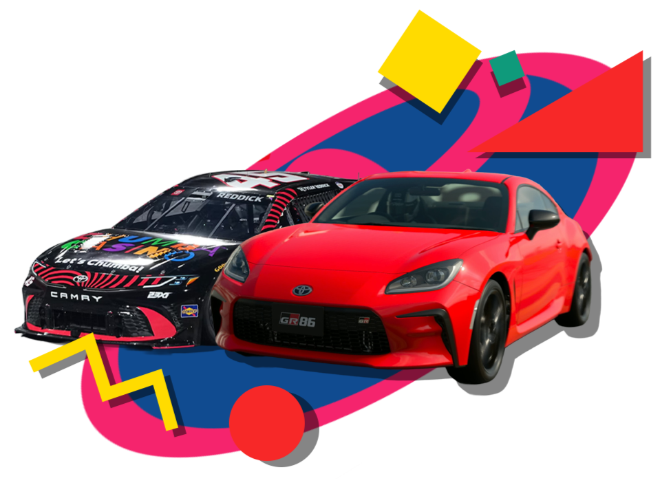
Toyota has dominated the early part of the 2026 NASCAR season, but that performance credibility doesn’t always translate to how audiences perceive their consumer vehicles. The challenge was to bridge the gap between NASCAR success and everyday relevance making Toyota performance feel immediate, relevant, and engaging.
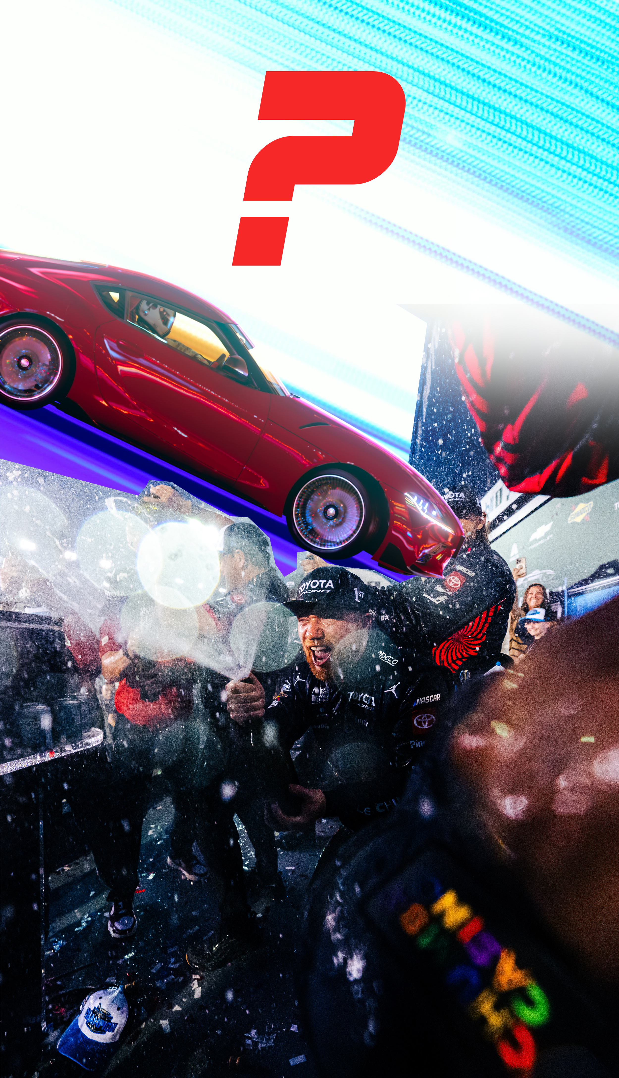
I developed a short speculative print campaign that uses racing momentum as proof of performance. By pairing bold, minimal copy with high-impact, high-speed visuals, the print campaign aims to connect Toyota’s success on the track to the feeling of driving their street cars. The concept centers around confidence and dominance, letting performance speak for itself.
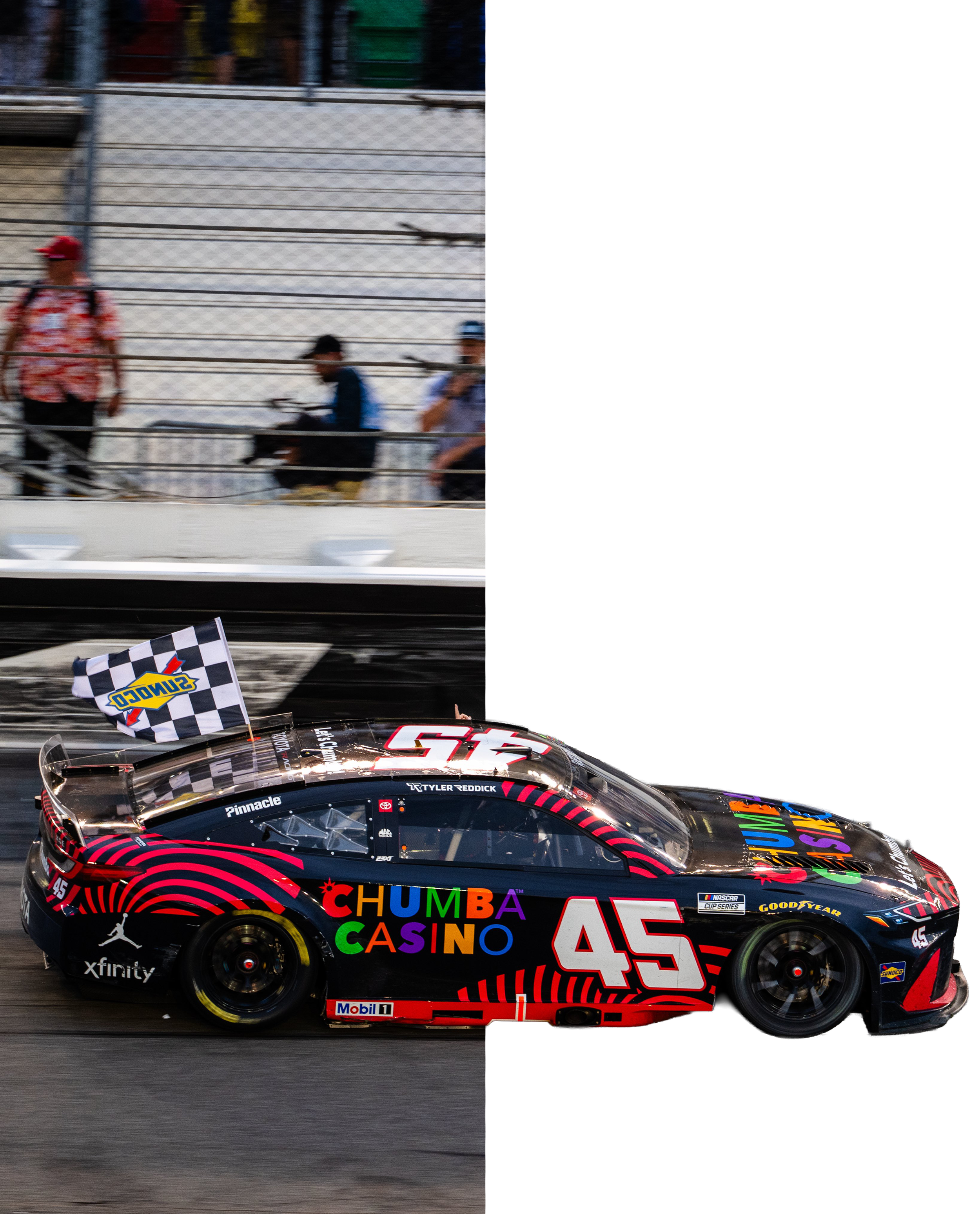
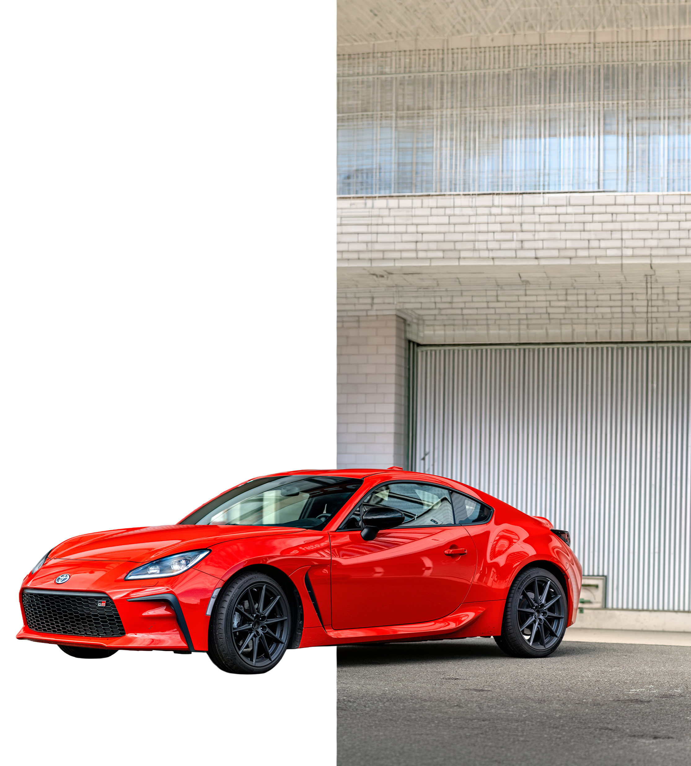
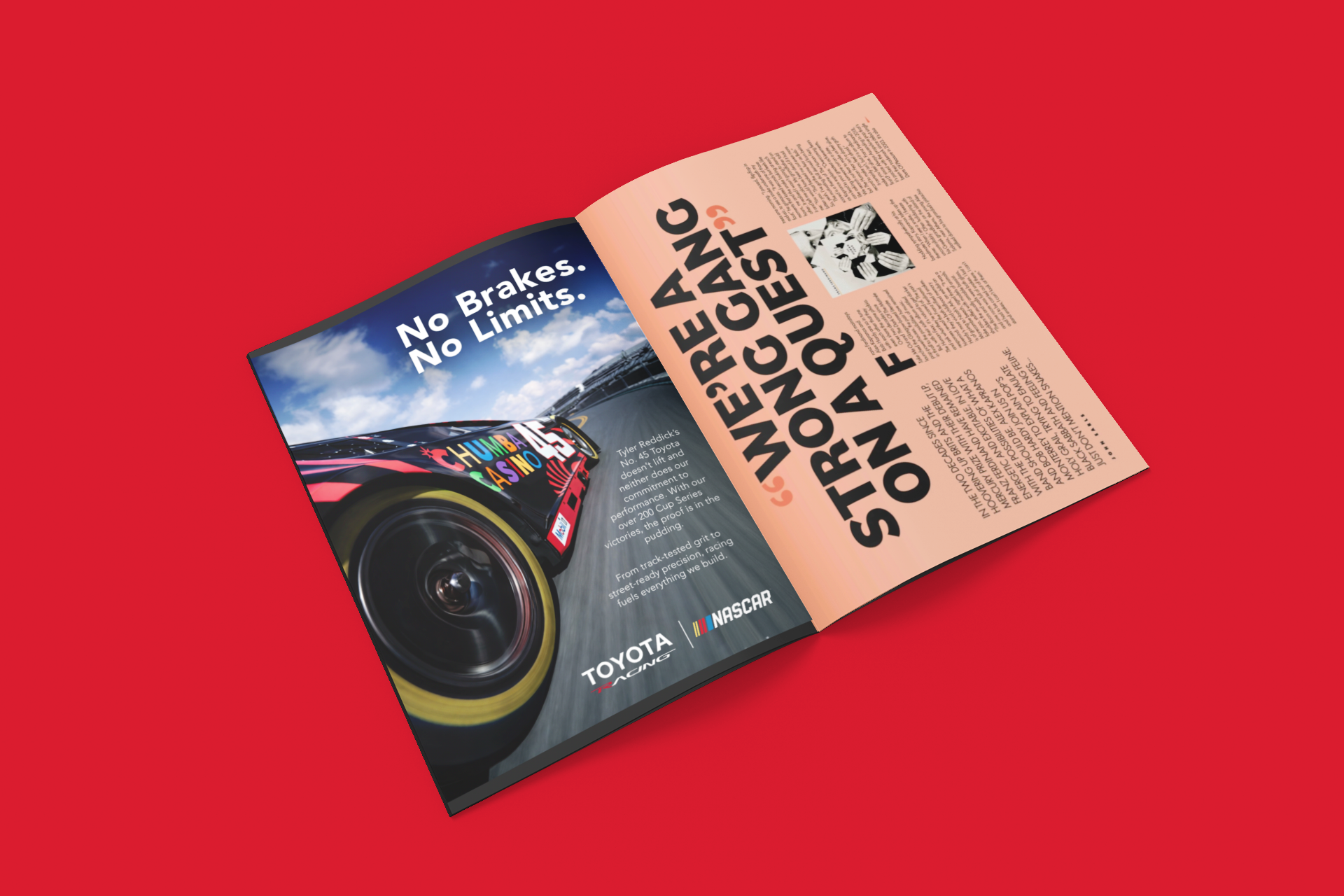
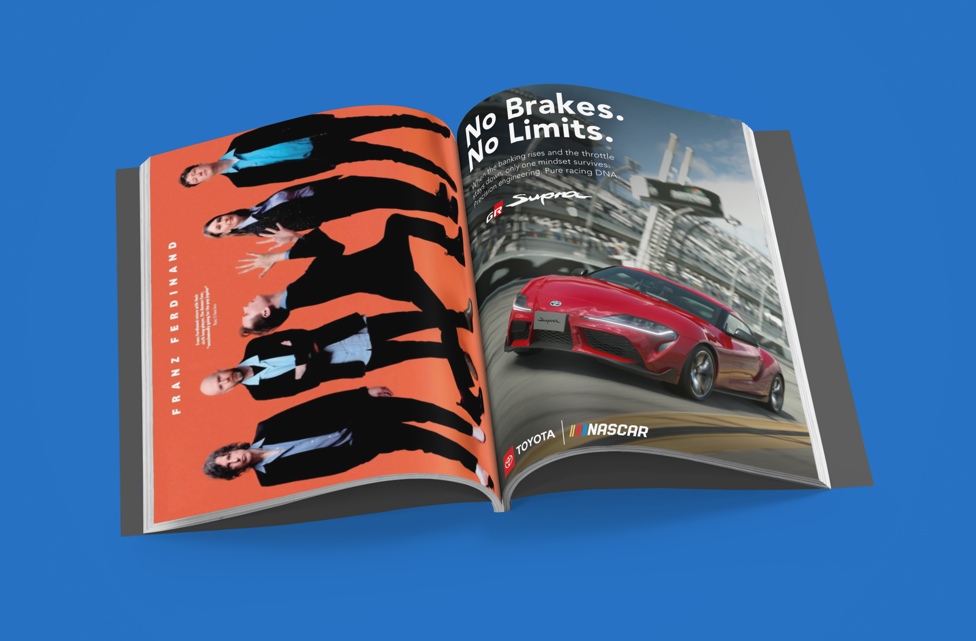
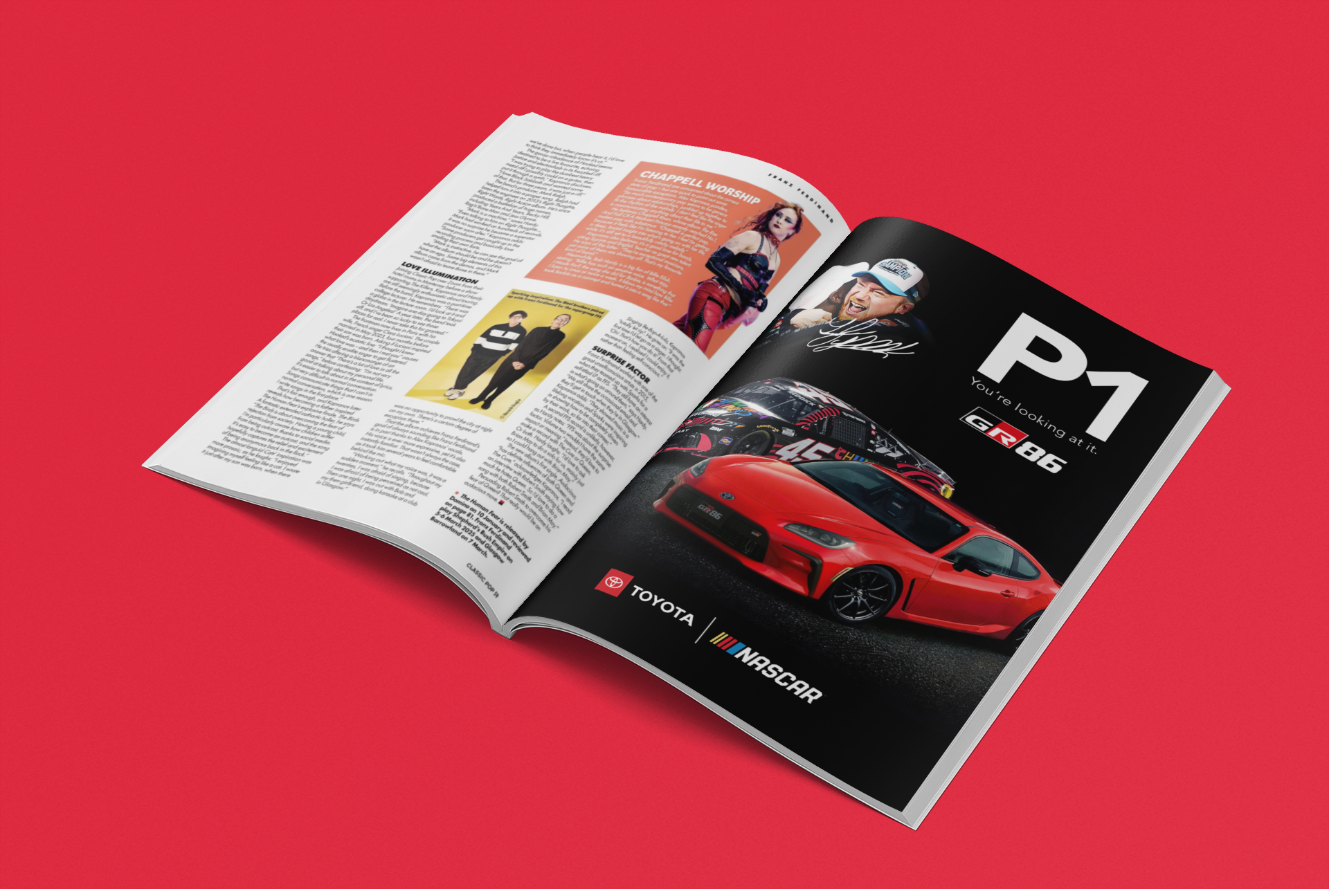
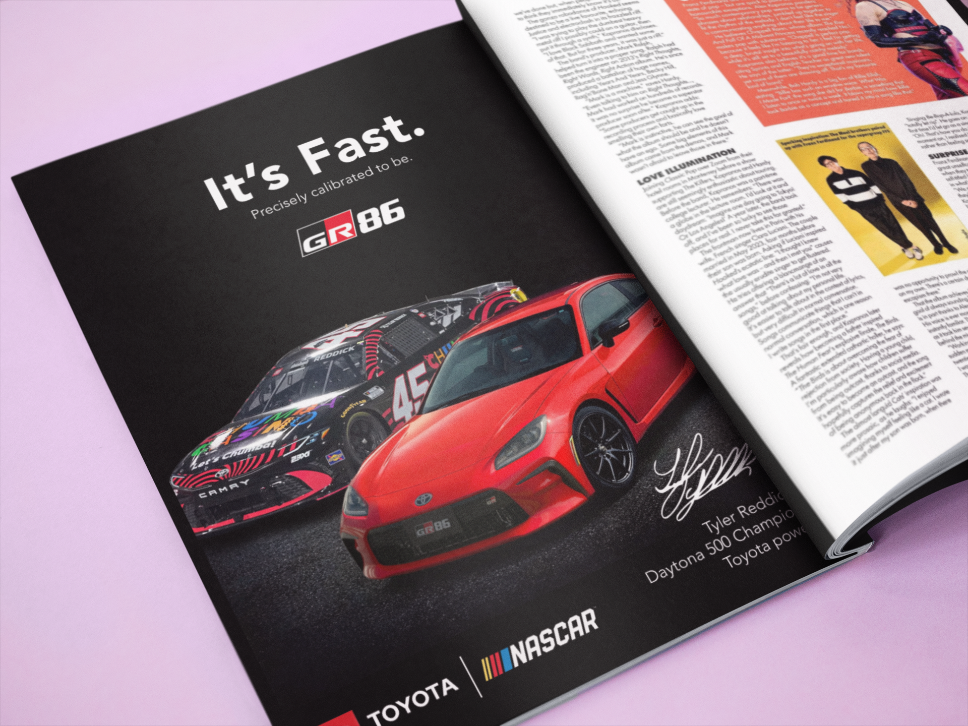
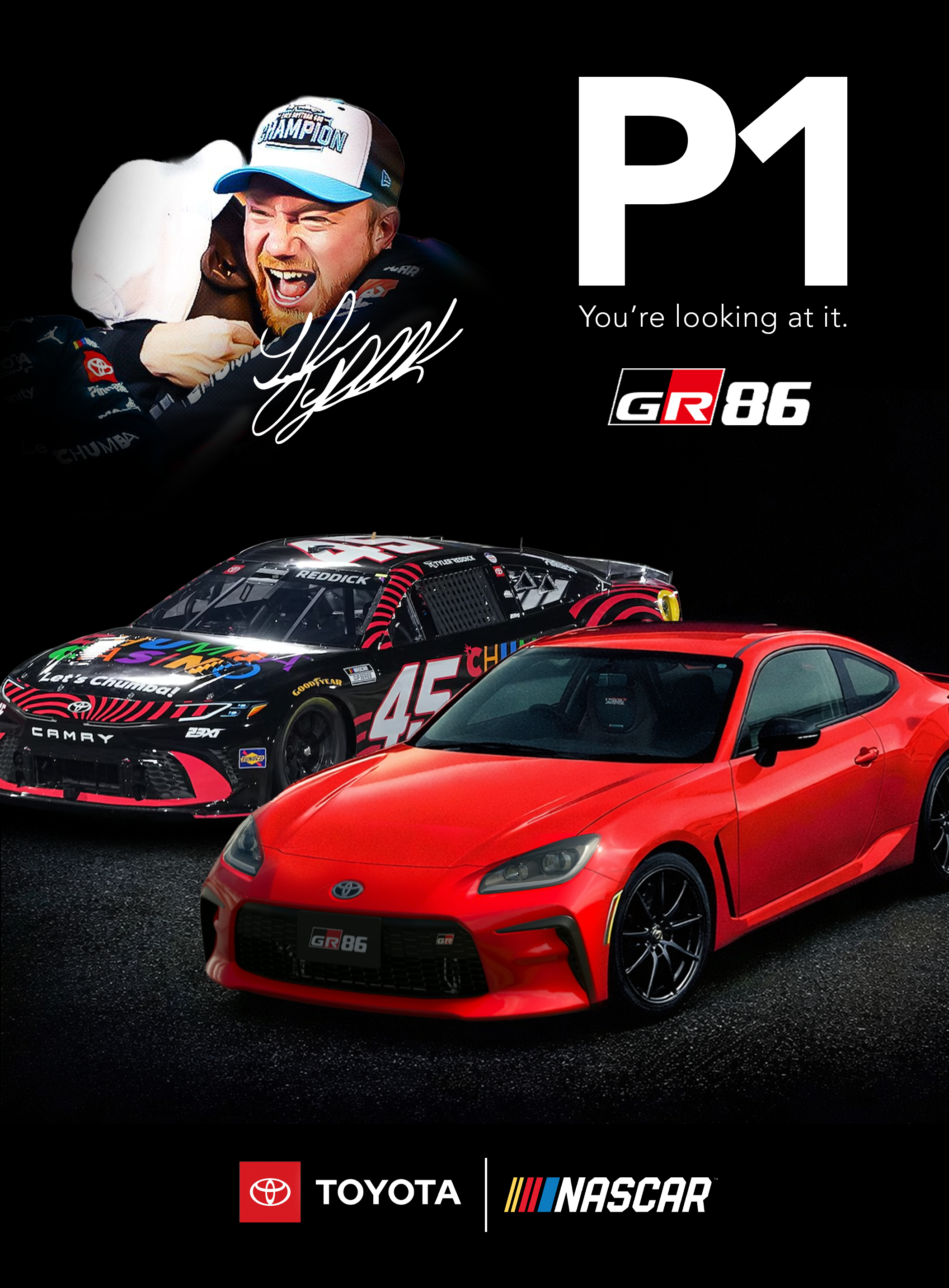
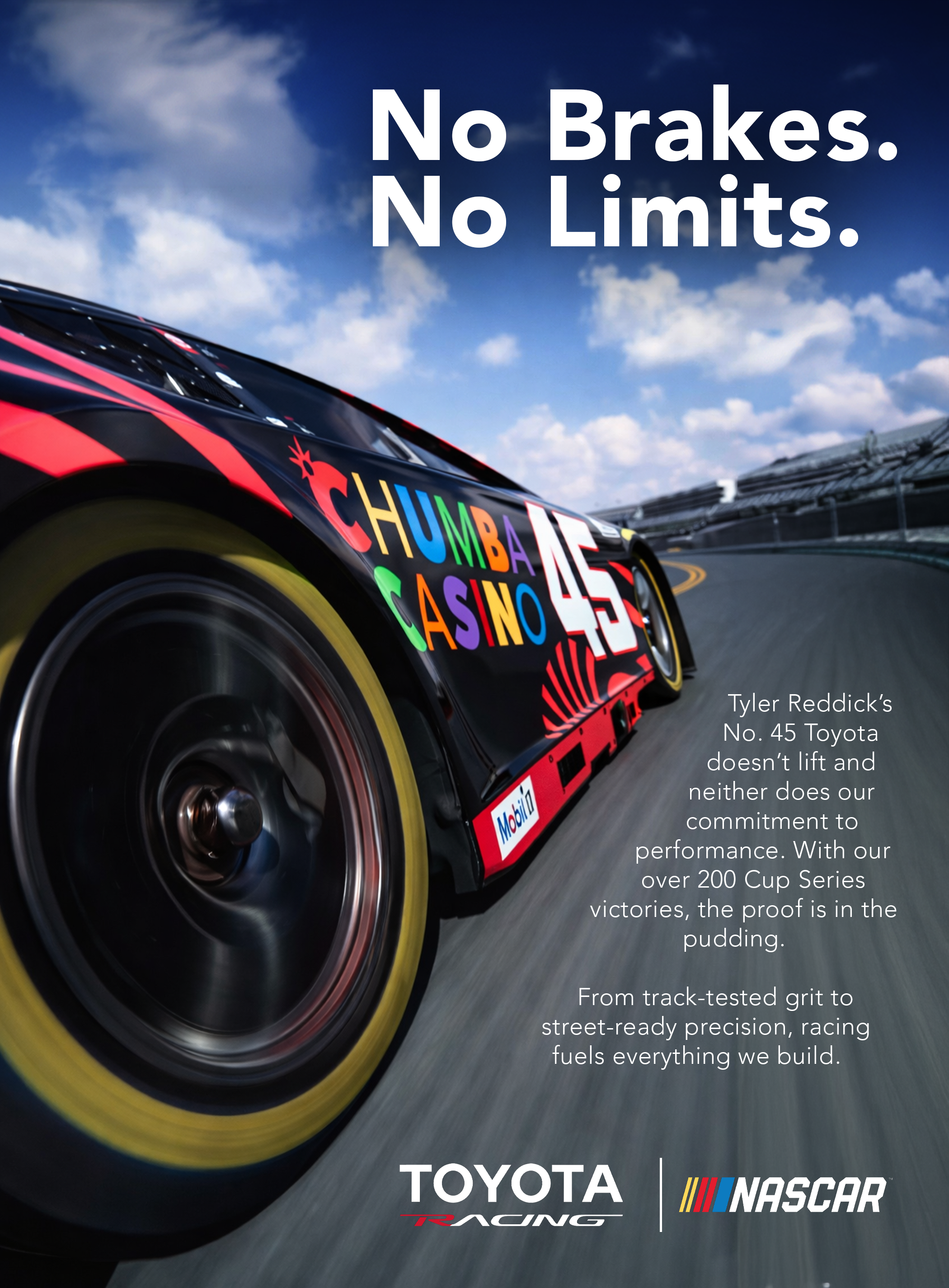
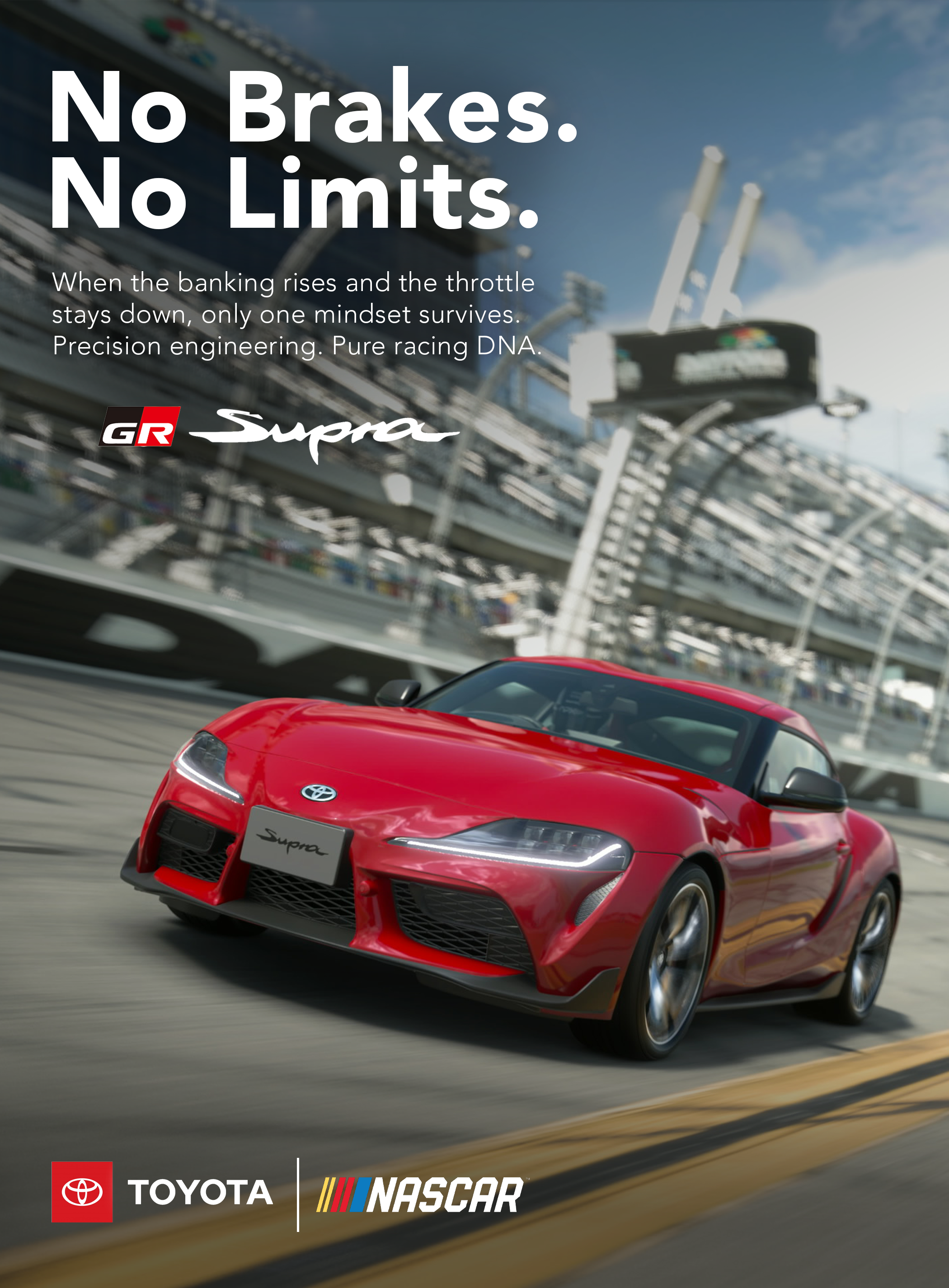
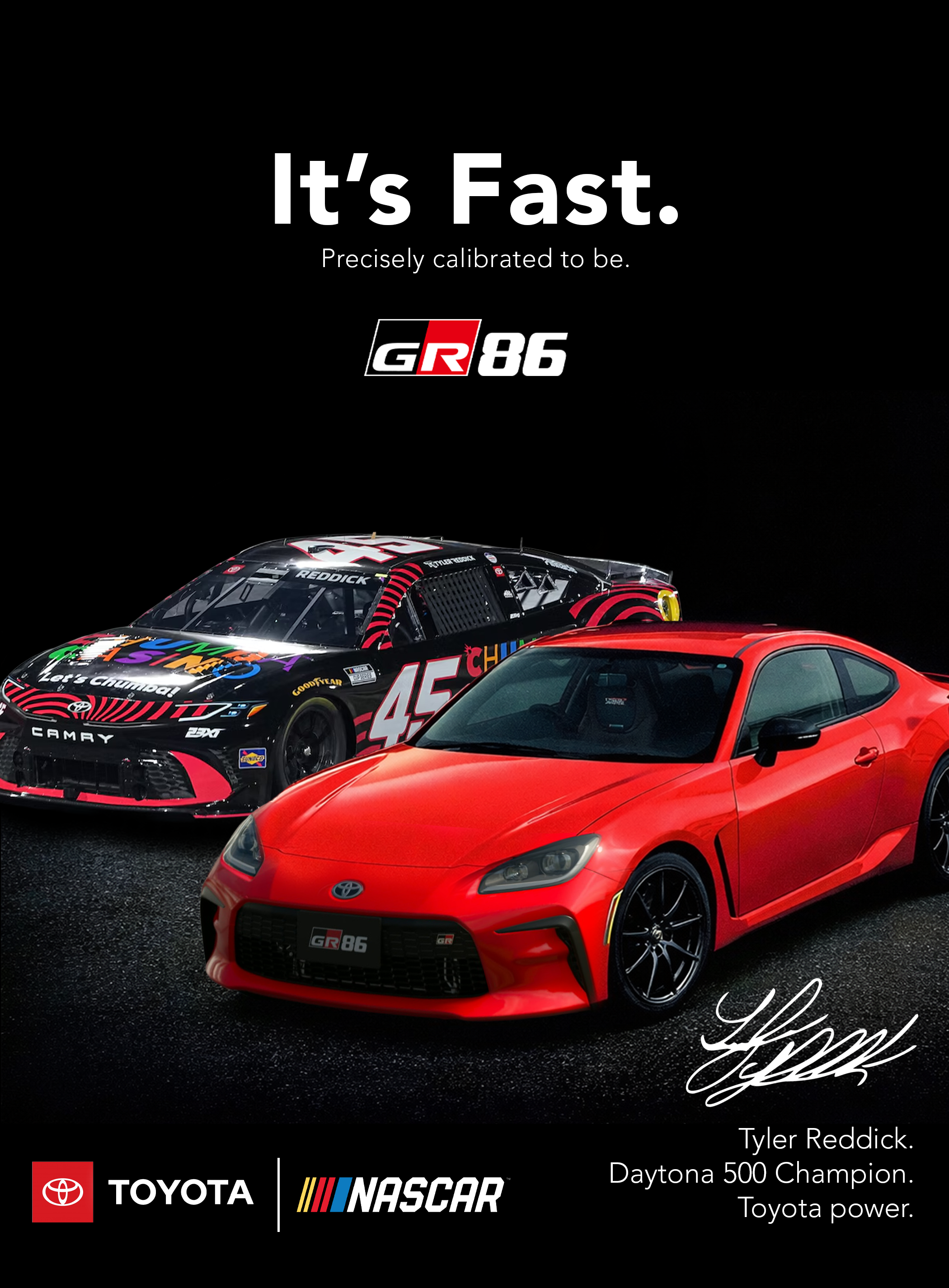
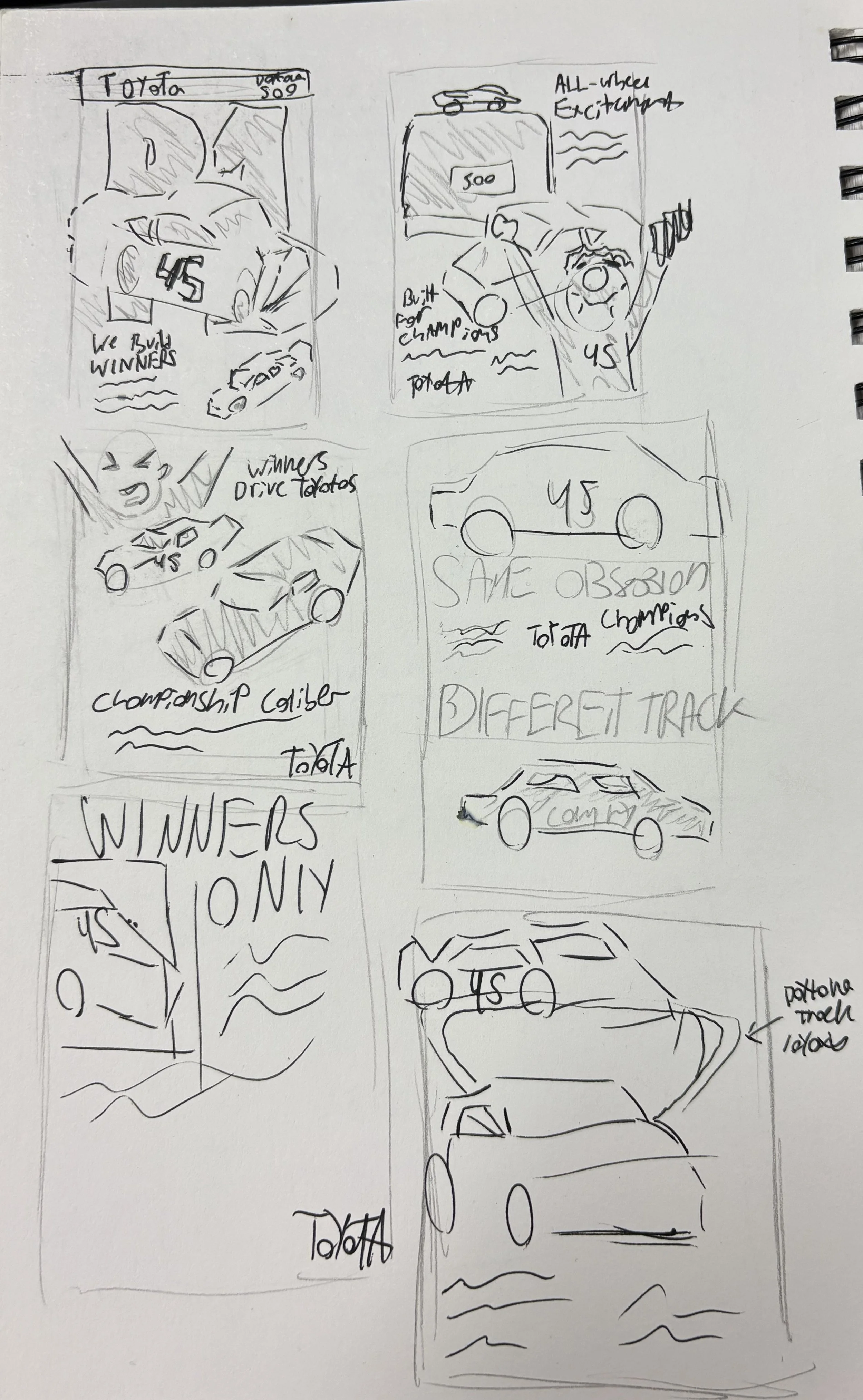
I started by analyzing Toyota’s own print ads, focusing on their bold voice and matter-of-fact attitude. From there, I explored composition and hierarchy through low angles, motion blur, and using negative space to emphasize speed.
Copy was refined to be short, declarative, and performance-driven, aligning with both motorsport culture and Toyota’s tone. I iterated on layouts to ensure each piece could stand alone while still feeling like part of a cohesive campaign.
The final work translates racing dominance into a visual language that feels bold, confident, and declarative. Balancing brand confidence with fresh creative direction was the main goal of this project.
This project served as great practice in conceptualization and art direction for performance-driven campaigns and reinforced how powerful simplicity can be when the concept is clear.