Goodyear competes in a category where performance claims are expected, but rarely felt.
Tire ads all say the same thing: performance, safety, durability. None of it really sticks, and none of it feels real. This makes it difficult to differentiate or create emotional engagement, especially with a younger, performance-oriented audience.
I wanted to tackle this issue and began strategizing and drafting.
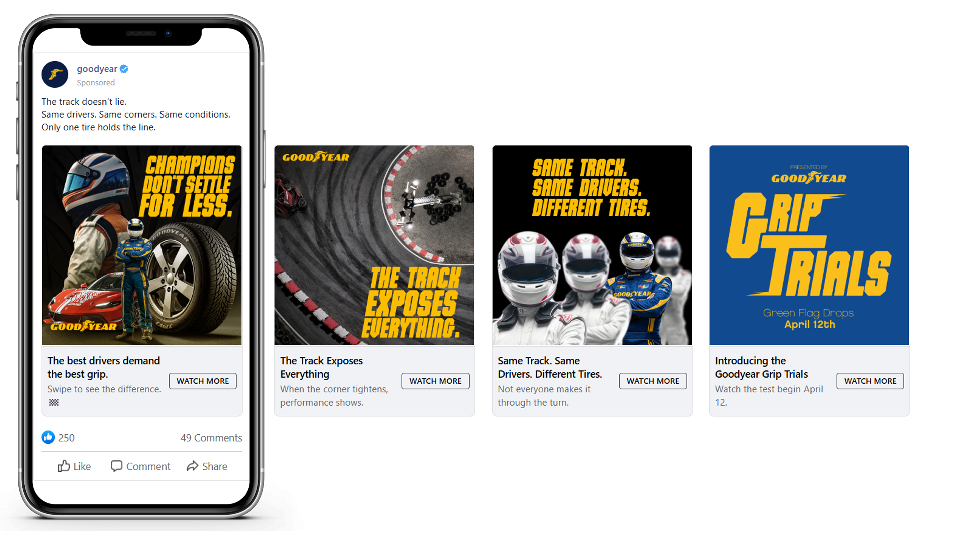
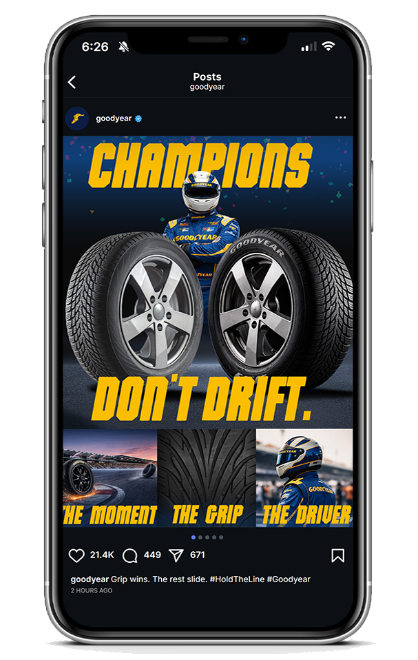
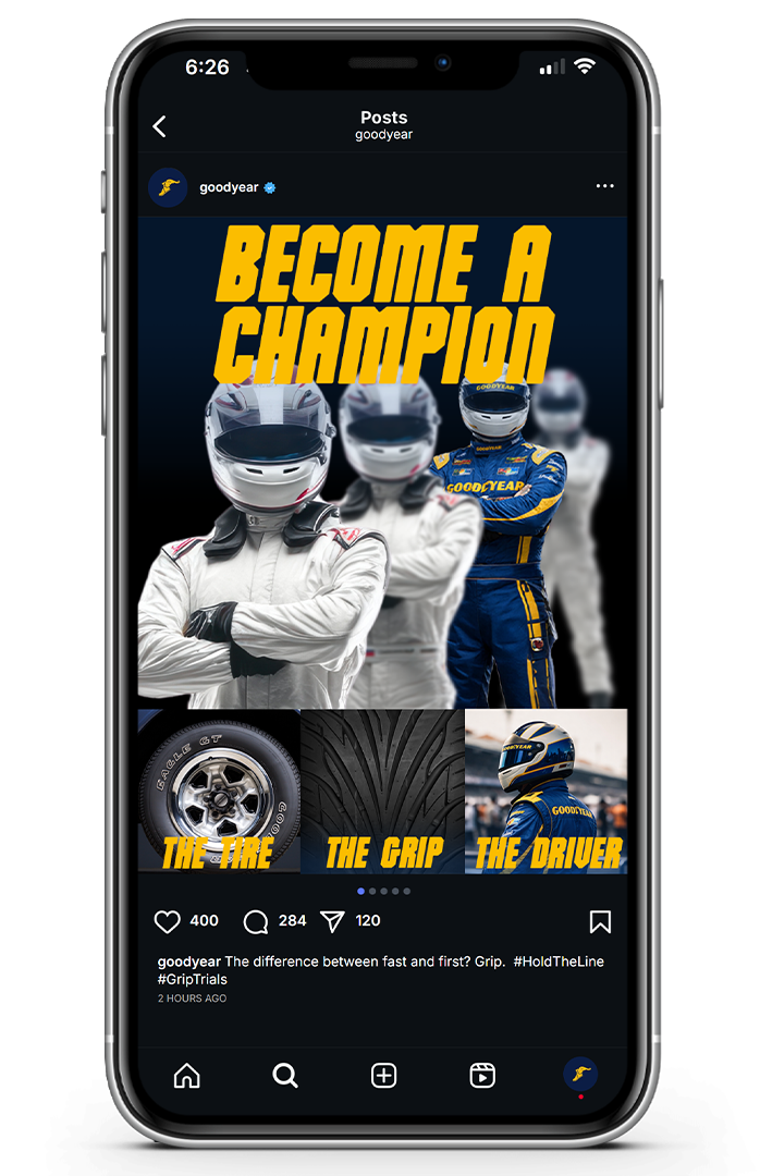
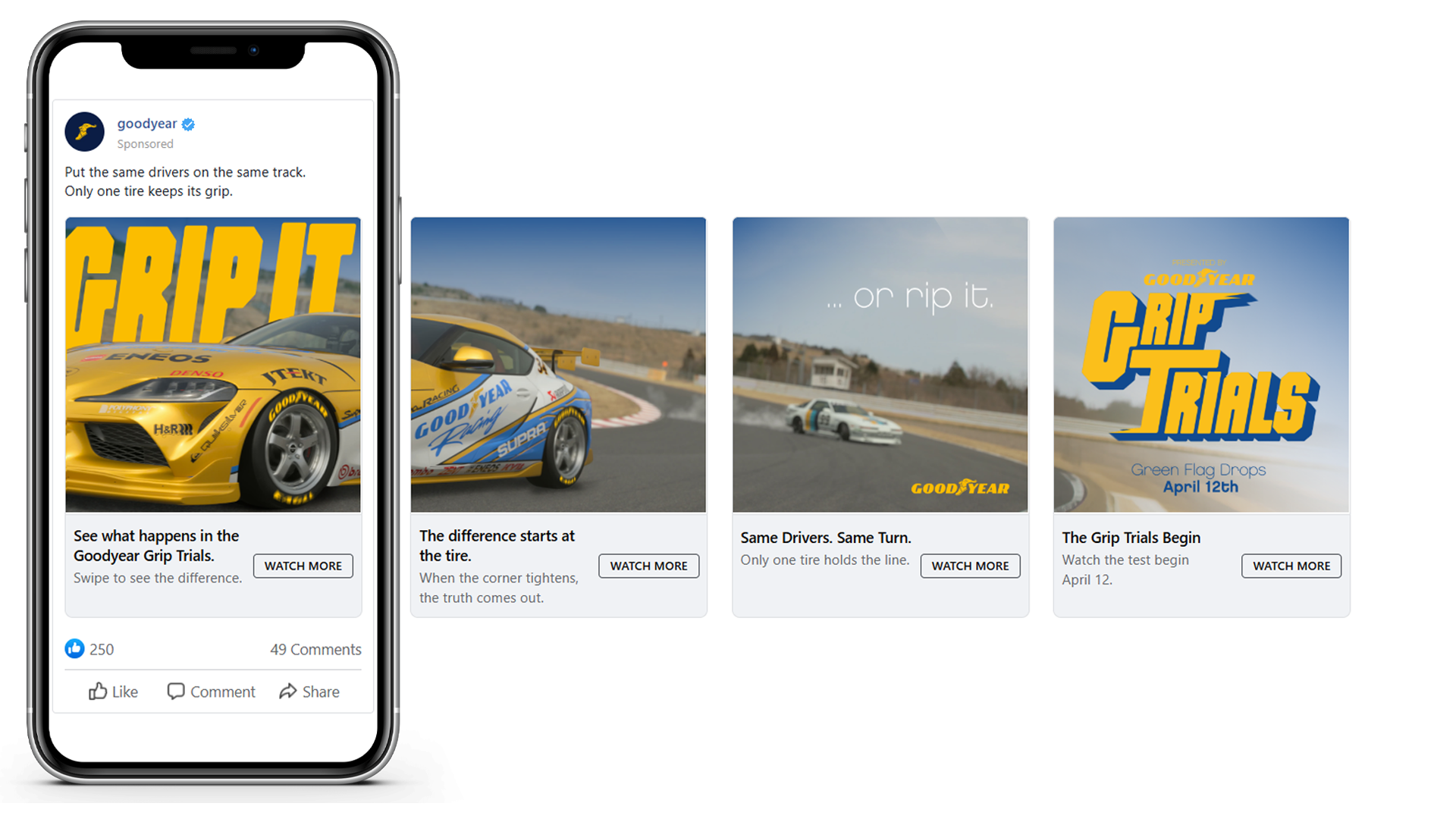
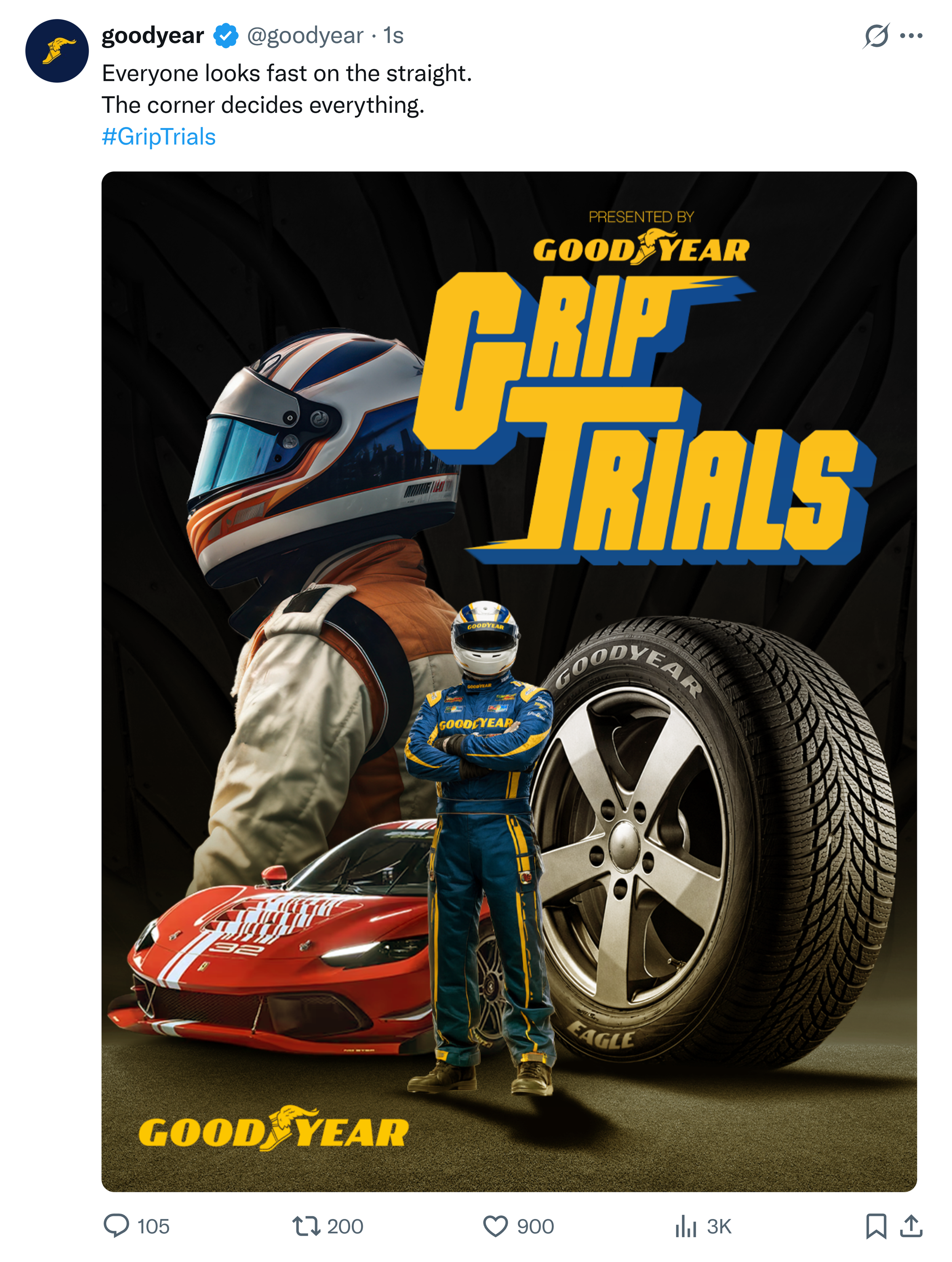
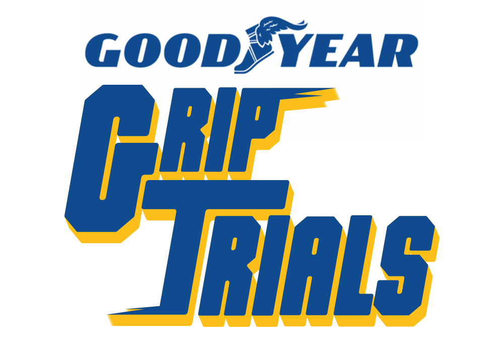
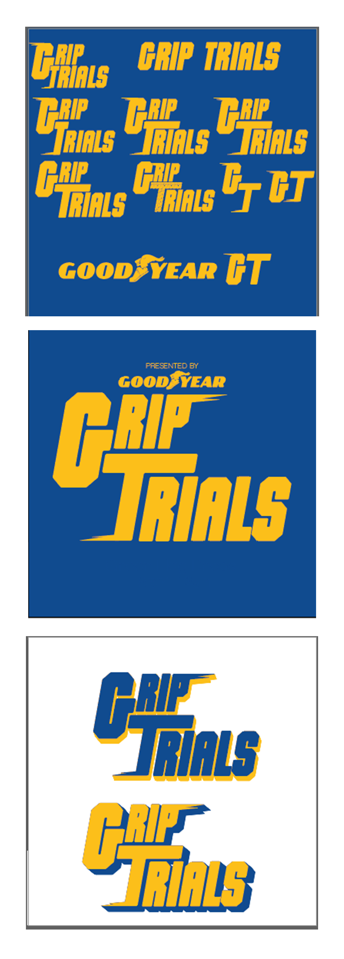
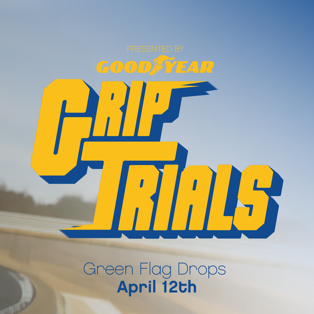
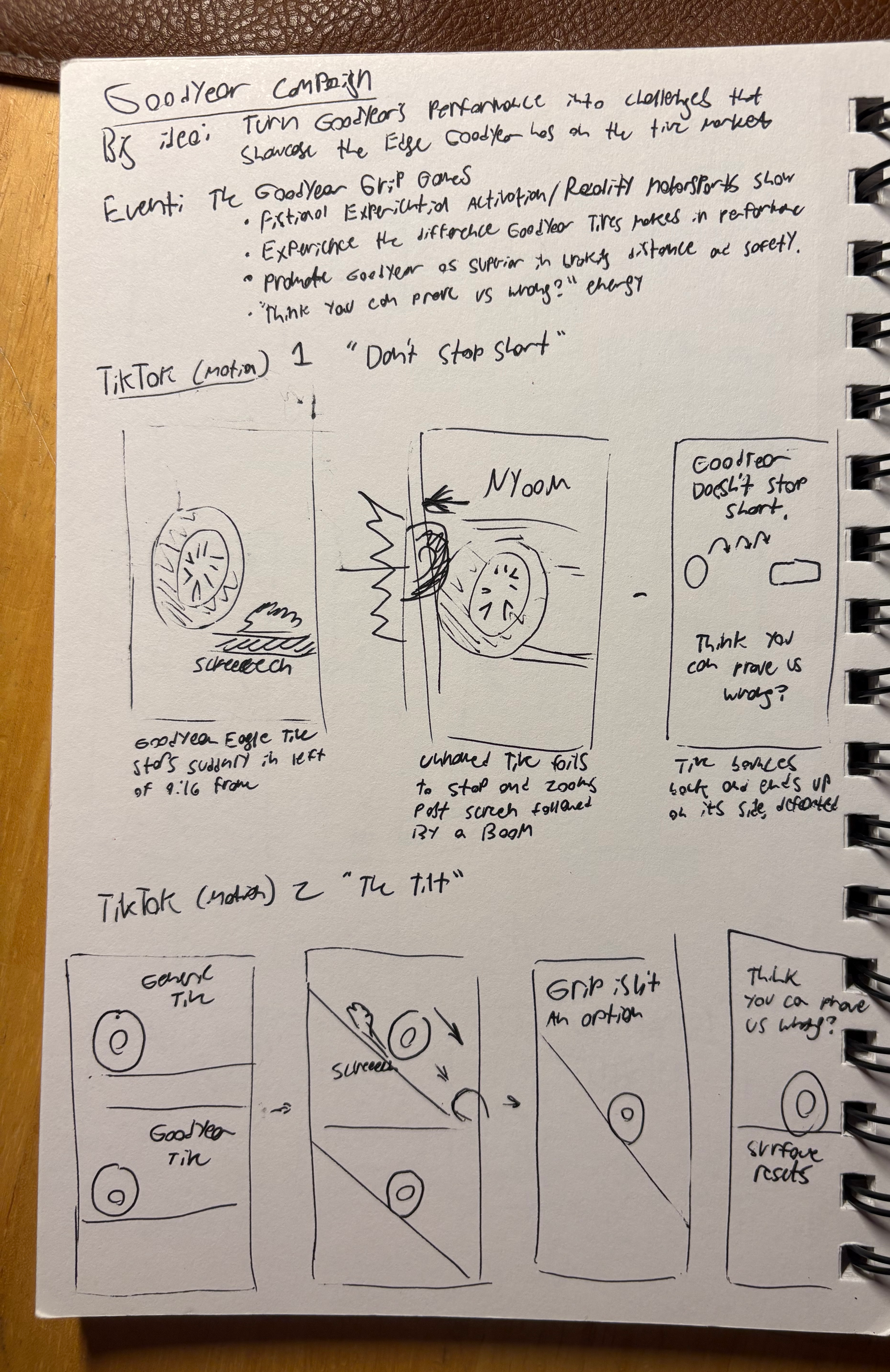
I created Grip Trials, a motorsports-inspired event concept that reframes tire performance as something to be proven, not claimed.
By positioning Goodyear as the tire that can withstand real, high-pressure racing conditions, the campaign shifts the conversation from product features to competitive validation.
The idea: don’t claim grip; prove it.


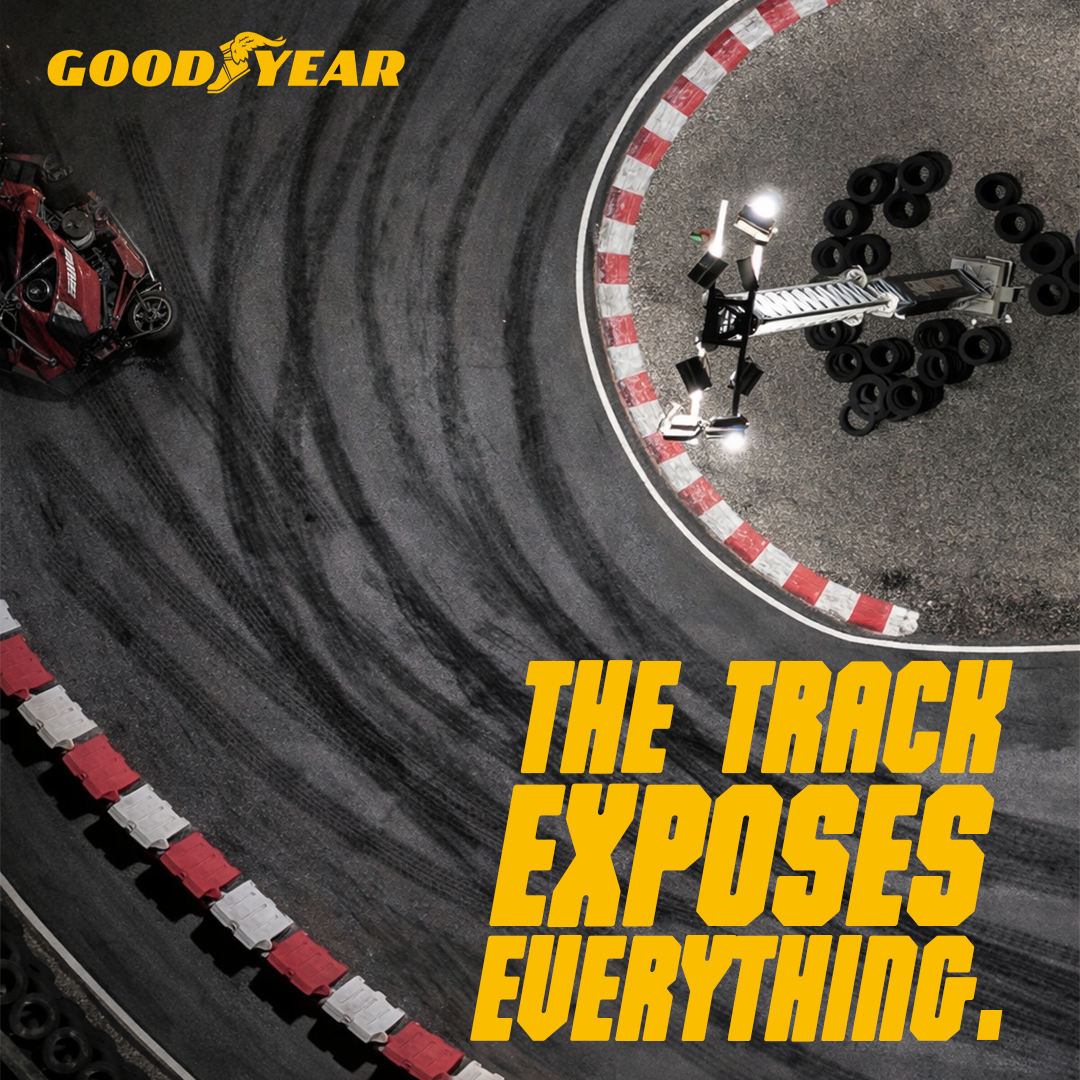

Everything came from one tension: holding the line vs. losing it.
I built the campaign like a competition series, where drivers and (specifically) their tires are pushed to their limit. From there, I applied these ideas to my assigned platforms:
TikTok as a hype-builder
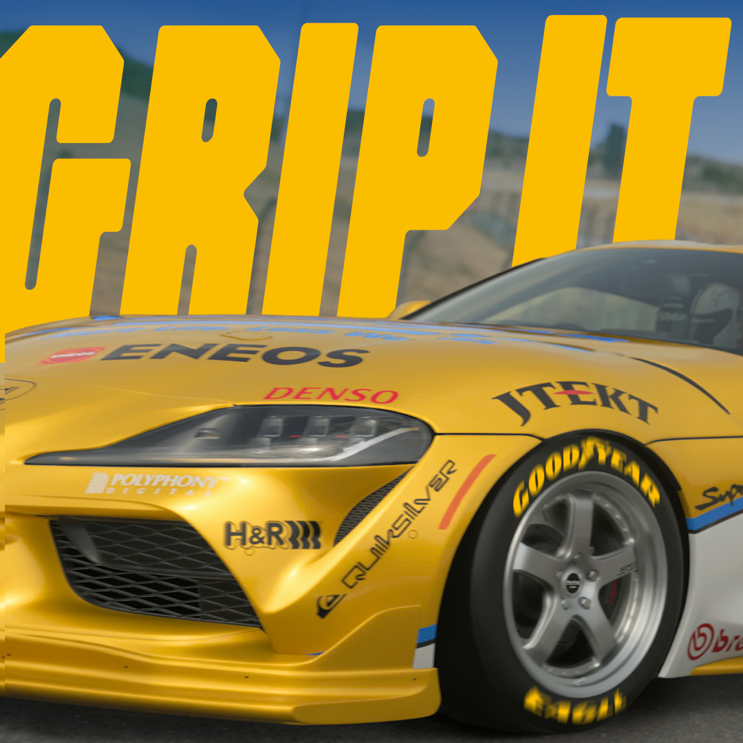
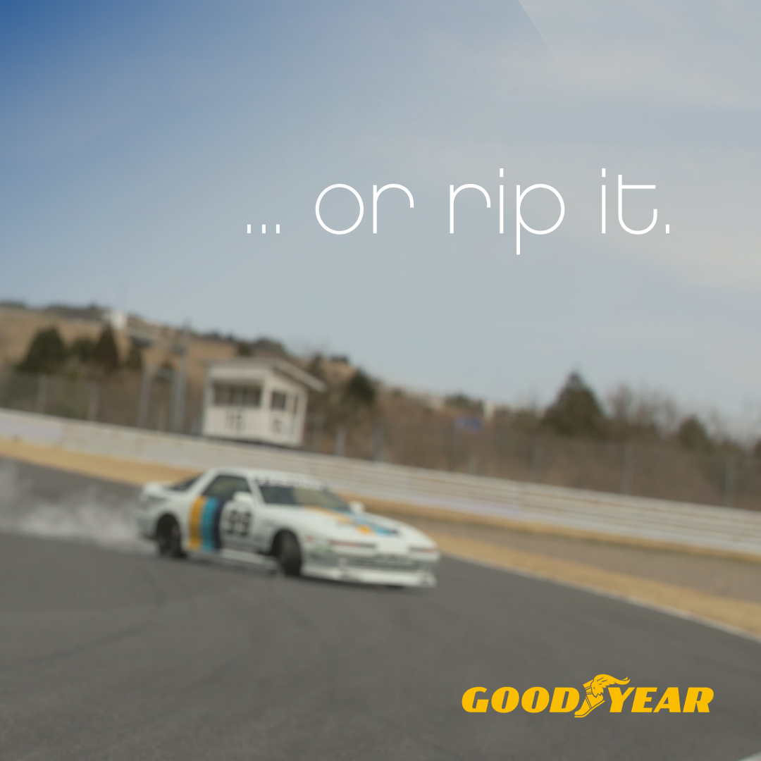
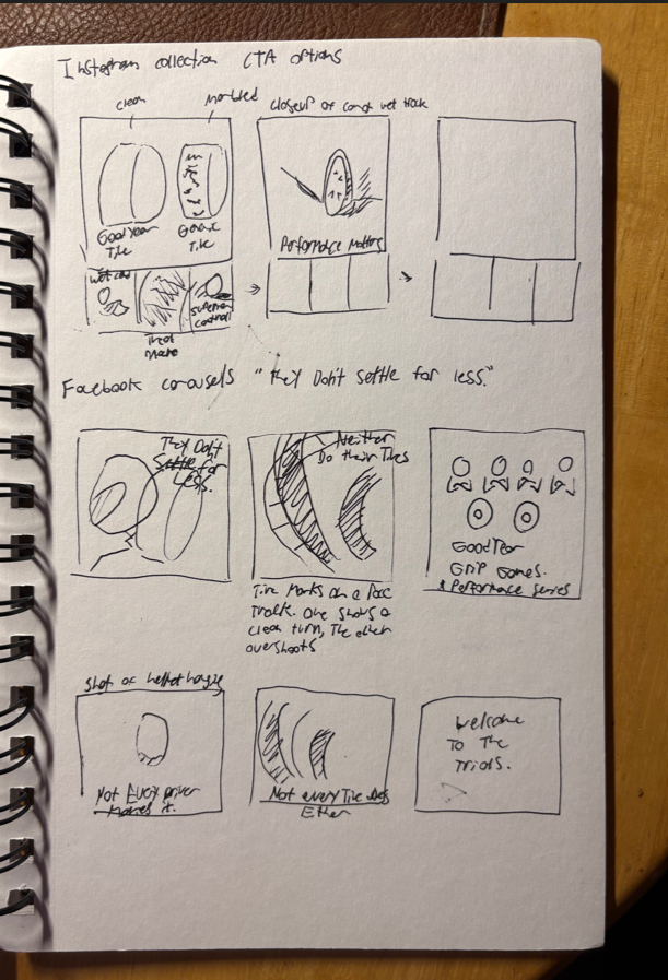
Instagram translates the experience to the product.
Facebook tells a story in four slides
X Takeover maintains awareness
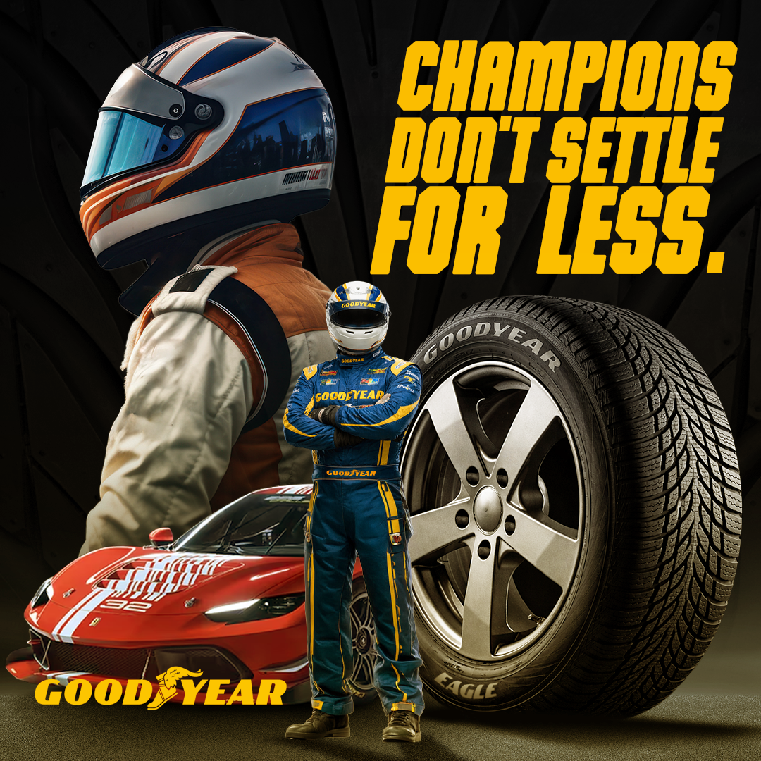
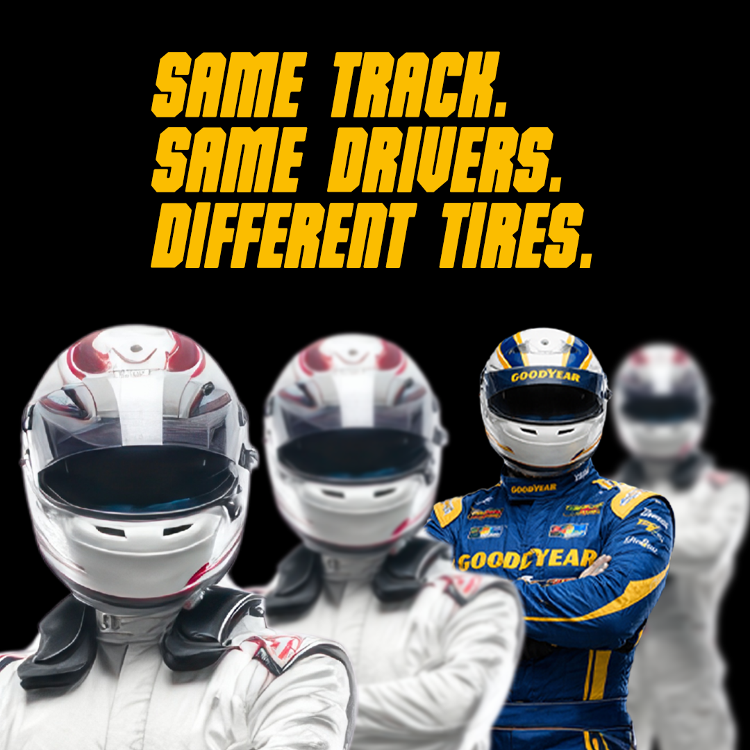
Visually, I focused on tight corners, tire grip, and side-by-side comparisons to make performance obvious without overexplaining it. Copy stayed short and confident with lines like “Champions don’t drift.”
Instead of another generic tire campaign, this turns Goodyear into something you can actually believe in because you see it perform under pressure.